Presentations are a visual and effective way of presenting information. It is an integral part of all online meetings
and business conferences.
In this article, we will not teach you how to present, however, we will share with you tips to make a memorable conference presentation, from the event organizer’s point of view.
How online presentations differ:
• The speaker does not always see the audience’s reaction. While it is possible to visually assess audience engagement at a physical meeting, during an online conference or webinar, the presenter often does not have contact with the audience. The microphones are usually turned off for everyone except the speakers, to avoid background noises. Take short breaks during the presentation to chat with some participants, ask them questions, and get feedback.
• To have eye contact with your audience, look directly into the camera.
• For a virtual presentation, it is important to have all the required technologies. A laptop, headphones, a microphone, and a ring lamp to illuminate the face if there is not enough light, are the minimum requirement. Check your internet connection.
Good presentation is a combination of meaningful and motivating information, stylish, and memorable presentation design elements. Every element has its meaning. Let’s look at the basic rules for creating a presentation, and the details that grab the audience’s attention.
The structure of the page. The best way to present your content is to have a good structure. Presenting your information in a thesis and adding lists to your content will give the reader an overview of what they are reading.
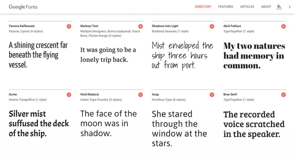
Fonts. You shouldn’t use more than two types of fonts. Choose the ones that support Latin and Cyrillic.
Google Fonts. This application allows you to visually match font combinations.
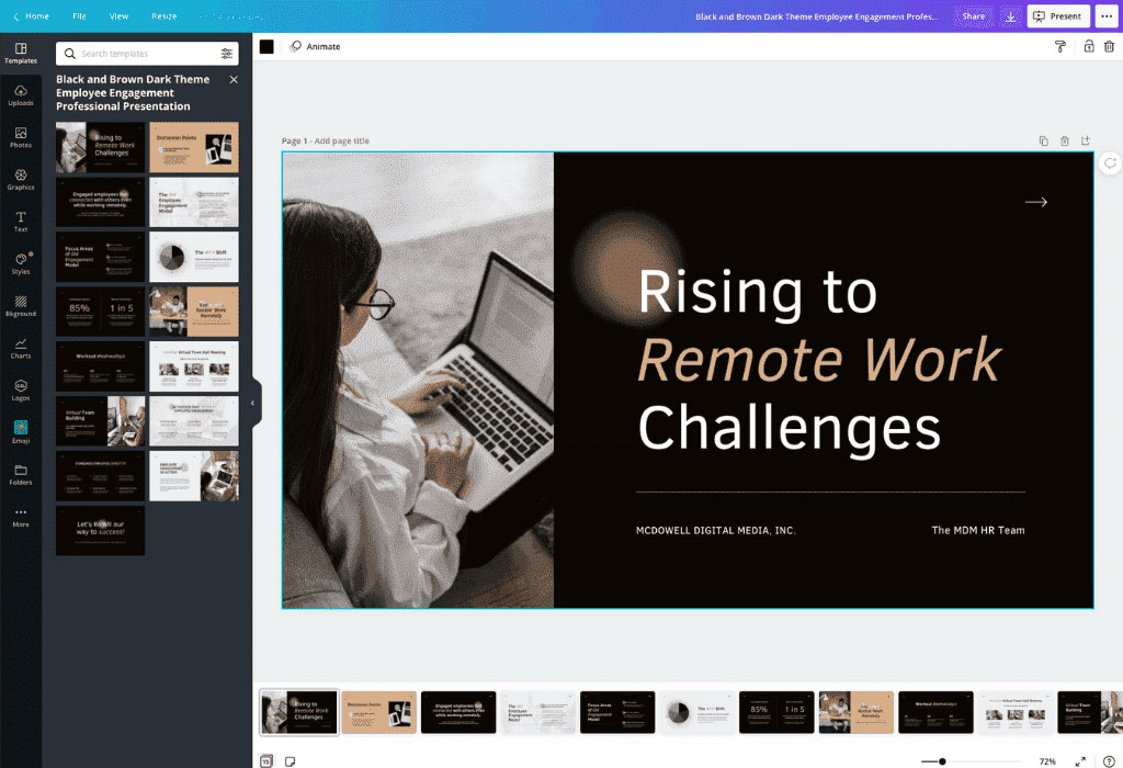
Infographics. Diagrams, graphs, and quotes attract the attention of the audience, clearly explain complex information, and replace the text with meaning. When doing the design, make sure to use the same style for all the elements used in your presentation. For example, Canva’s slide design service has a whole line of similar templates in the sidebar that you can combine.
Solid background. To make the text easy to read, the background should be solid. Ornaments and prints are visually distracting.
Placement of pictures on the slide. If the picture takes up the whole page, to avoid losing quality, choose a resolution that is at least the same as your computer screen’s resolution.
A call to action at the end. Instead of the phrase “Thank you for your attention!” on the last slide, include helpful information or a call to action. For example, company contacts, a QR code by which you can go to the website or ask a question to participants.
Palettes for finding color solutions
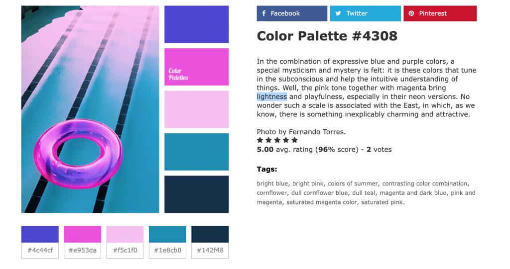
The resource contains photos taken by professionals. The color combinations are pleasing to the eye. Under each photo, there is a palette of five basic shades with numbers. Use colors from one palette to design your slides.
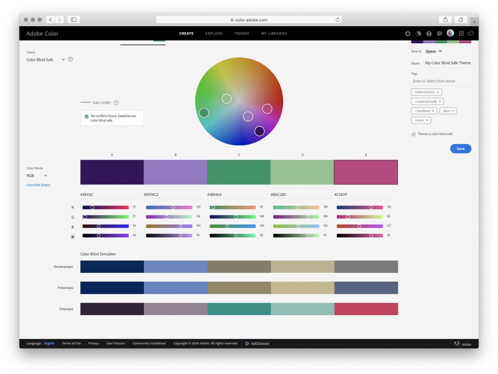
The service helps you choose harmonious color combinations using the color wheel.
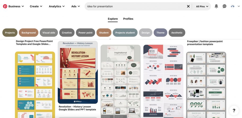
On this social media site, you’ll find sample presentations to inspire designs for your slides.
Programs and services for creating presentations
It’s time to get acquainted with the services that will help you to create a presentation yourself. Let’s look at the
three most common ones.
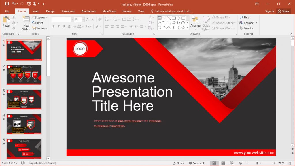
Suitable for a beginner and a designer. Here are all the tools for creating and delivering presentations:
– Automatic or manual slide change
– Built-in templates
– The ability to add media objects of
any format.
– Animated charts.
– Compatible with other applications.
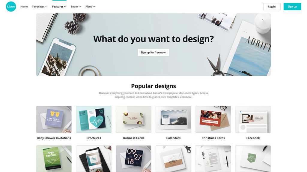
To create a presentation, just drag the desired element onto the page.
You can find lots of ready-made templates. You can also add animation elements. It allows you to work on projects together.
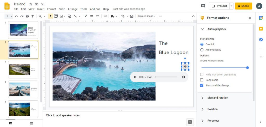
Like other Google applications, this program is often used for our work. The created presentations are saved to Google Drive, which is convenient and there is no need to duplicate them on electronic media.
You get access to the file from any point where there is a network. In terms of functionality, Google Slides is almost the same as PowerPoint. Compatible with files created in this program.
Conclusion.
We hope that in this article we have given you some tips on how you can improve the visibility of your presentation. You don’t need to be a designer to design a presentation. Modern apps make it easy to create beautiful and stylish slides.
Follow us on Facebook
Follow us on Twitter
Add us on LinkedIn
